“That’s it! An Electronic Army!” — Hackers and the Dream of the 1990s

hackers-poster

Hackers – dir. Iain Softley – 1995

The 1990s, in hindsight, were totally manic. Staggering economic prosperity (in the United States, at least) combined with a span of relatively little war (other than short dustups such as the Gulf War and the Bosnia conflict) resulted in a level of optimism not seen since the 1950s. While there were problems, of course, from the lens of the present they seem relatively minor, considered severe at the time only because of the relative lack of adversity present in the era.

The German word “zeitgeist” describes the pervasive intellectual school of an era, the “spirit” that influences and informs the artistic works of that timeframe. There are numerous times and styles that seem to confirm the idea of the zeitgeist, film in the 1990s being no exception. In specific, action films of the decade seemed to share a delirious optimism, the idea that victory can be achieved against all odds — and 1995’s Hackers is a prime example.

Continue reading

Connection Terminated — Artificiality in the Works of Mariko Mori and Jean-Michel Basquiat

In the post-modern era, it’s hard to find a pair of artists more different than Mariko Mori and Jean-Michel Basquiat. The former, a Japanese real estate heiress turned model, dealt primarily in photography, digital art, and some sculpture in her work from the late 1990s to the early 2000s — works that evoke a dreamlike, almost hyper-real aesthetic. The latter, a trilingual child of Haitian and Puerto Rican descent, worked in a style derived from his earlier street art, crayons and paints in harsh, jarring styles.

However, both Mori and Basquiat — despite creating works informed by nearly opposite experiences — seem to tap into a common vein: a  tinge of artificiality perceived in world around them, possibly relating to a feeling of disconnect. While this theme is common to the two of them, the imagery (like their backgrounds) could not be more different.

Mori_Birth_Of_A_Star-975x1436

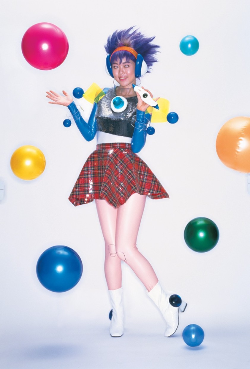
Birth of a Star – Mariko Mori – 1995 – photograph / digital

Most of Mori’s early photography work features herself as a model, almost exclusively in-costume as a character of her own design. In Birth of a Star, she lampoons a Japanese television program of the same name, turning herself into an artificial pop artist.

Of particular note in this image are her hair (reminiscent of the popular “Troll” figurines,” her eyes, and the mechanical-looking outlines on her knees. The result is alien, almost unsettling, especially when observed for a longer period of time.

philistines.jpg!HD

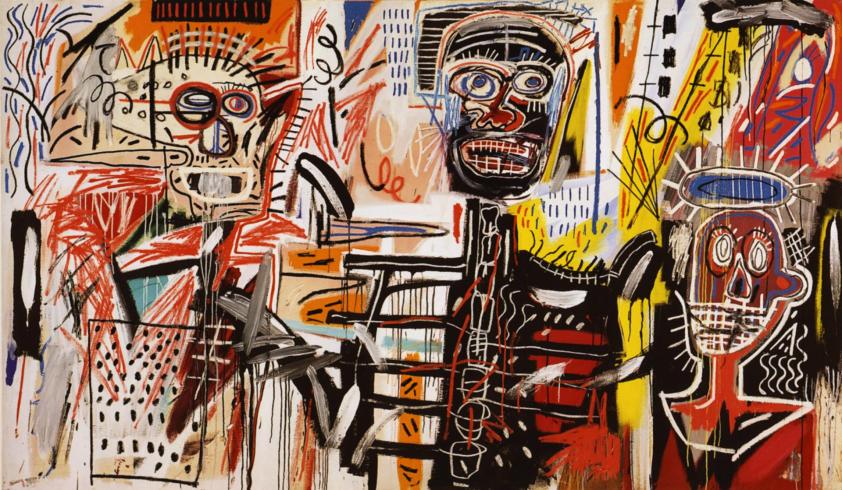
Philistines – Jean-Michel Basquiat – 1982 – acrylic / crayon on canvas

Though some observers may consider Basquiat’s style to be unsophisticated, perhaps even childish, I could not disagree more. Though they share much in common with street art (which is often relatively simplistic), the attention to detail in his works is astonishing and deliberate. I personally find them to be jarring and challenging — though not unpleasant to view.

While Basquiat was inspired in part by a copy of Gray’s Anatomy (given to him during a hospital stay following a childhood accident), his use of straight lines is relevant to our discussion here. The forms in Philistines take on an almost mechanical quality, with the mouths of the subjects appearing to be grates, their heads and chests appearing to have rivets. The figures could almost be taken as fake people, automatons spawned by the cultural norms Basquiat sought to protest.

9841f67f25baef1407864e1ebaf82fb0

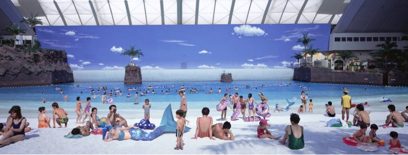
Empty Dream – Mariko Mori – 1995 – photograph / digital

Mori appears as a mermaid four times in this image, another of her surreal characters which seems to be retain the mythical role of its source material. In addition, the setting (an indoor beach) adds a further skew from reality — resulting in a scene depicting a magical creature in an artificial place. We’re left not sure if Empty Dream is reality, a virtual construct, or something else entirely.

fallen_angel-orig

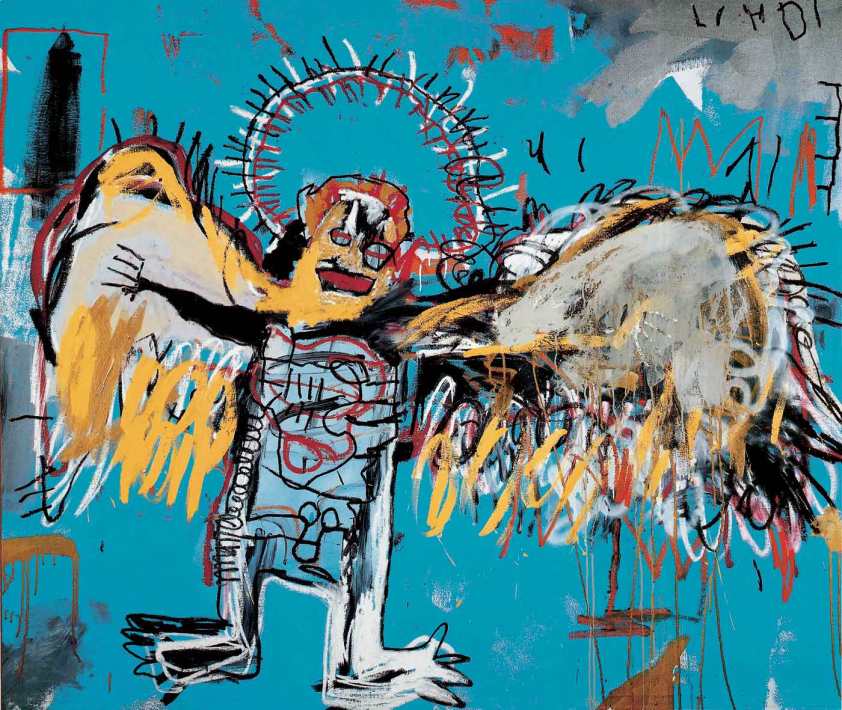
Untitled (Fallen Angel) – Jean-Michel Basquiat – 1981 – acrylic / crayon on canvas

In corrupting the classic Judaeo-Christian imagery of angelic beings, Basquiat seems to call into question beliefs that are considered typical in our society at large. Artificiality makes an appearance here as well — the angel’s eyes evoke lenses, while the halo could almost be seen as a fluorescent light. The choice of bright, bold colors in a limited palate reinforces a feeling of a being that is beyond the real, despite being a product of it.

mariko-mori-dream-temple-1997-1999-richard-learoyd

Sky Temple – Mariko Mori – 1995 – sculpture / digital

The science fiction writer Arthur C. Clarke once stated that “Any sufficiently advanced technology is indistinguishable from magic” (often referred to as “Clarke’s Third Law”). One of Mori’s first works outside the realm of photography, Sky Temple is part multimedia installation, part sculpture, and fits Clarke’s Third Law to a tee. Though it clearly mimics the style and form of a Buddhist or Shinto temple, the use of glass and lighting conveys the structure beyond reality. This hyper-real feeling leaves us guessing, yet again, if the structure is mythical, or simply technological.

head.jpg!HD

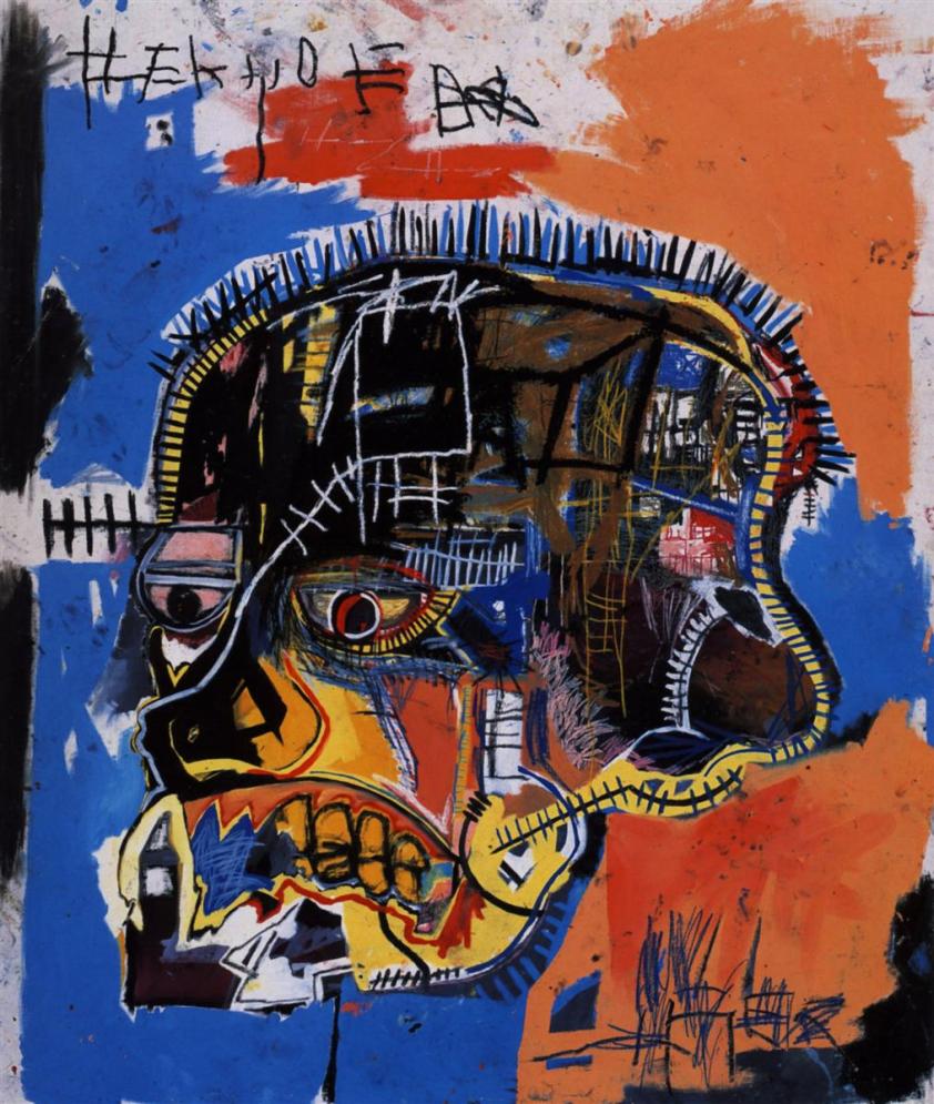
Scull – Jean-Michel Basquiat – 1982 – acrylic / crayon on canvas

With its exposed scaffolding and lines that resemble railroad lines, Basquiat’s Scull manages to seem metallic despite its use of strong primary colors. Though it may be a little surreal-sounding, I’d argue that we’ve all felt like Scull looks at some point or another in our lives — struggling with our emotions and stresses, despite the barriers we erect within as demanded by our society and culture.

“The Artist.” Jean-Michel Basquiat. N.p., n.d. Web. 28 July 2015. http://www.basquiat.com/artist.htm

Itoi, Kay. “Tea with Mariko.” Artnet.com. N.p., 20 Nov. 2001. Web. 28 July 2015. http://www.artnet.com/Magazine/FEATURES/itoi/itoi11-20-01.asp

“Mariko Mori.” Sean Kelly Gallery. N.p., n.d. Web. 28 July 2015. http://www.skny.com/artists/mariko-mori/

Brown, Emma, and Henry Geldzahler. “New Again: Jean-Michel Basquiat.” Interview Magazine. N.p., Jan. 1983. Web. 28 July 2015. http://www.interviewmagazine.com/art/new-again-jean-michel-basquiat-/#_

Rejecting Tradition – Early Modern Art as a Response to the First World War

The first World War was referred to as the “Great War” in its time, and as the first modern war, it’s easy to see why. Fervent enemies and new technologies combined to create destruction and death on a scale unmatched in any previous conflict. The world was left in shock by the conflict, and Europe was, in effect, scarred and traumatized by it.

The generations that lived through the war were, understandably, traumatized by it, and the effect is visible in the art created during and immediately following the war. The motif became one of rejection — rejecting the traditions and old blood that had caused the savage eruption of violence, and in turn, re-defining the meaning of the term, and the standards of different mediums.

Duchamp-roma-3

Apolinère Enameled —  Marcel Duchamp, 1916-1917

While Duchamp is most famous for his 1917 piece, Fountain, I personally find Apolinère Enameled to be a much more compelling piece overall. As with many of his works, Enameled started life as an existing work, in this case an advertisement for a brand of paint. Rather than simply signing the work, Duchamp modified the piece, creating an “impossible object” that cannot exist in three-dimensional space.

The “found object” motif of Dada art is already one that inherently rejects tradition — using existing items and re-purposing them into art flies in the face of classical artistic methods. But the additional use of an optical illusion seemingly offers a nod to the surrealist style, while adding yet another point of contention with artistic styles — rather than portraying the world or one’s impression of the world, Duchamp presents an item that literally cannot exist, an open rejection of most existing artistic forms.

surrealism_salvador_dal_artwork_1024x768_wallpaper_wallpaper_2560x1920_www-1-wallpaperswa-com

The Persistence of Memory — Salvador Dali, 1931

Easily Dali’s most famous piece, The Persistence of Memory is perhaps one of the more shocking paintings of the modern era, and its meaning is speculated on even today. It’s one of my very favorites for this reason — the subject matter is almost laugh-out-loud absurd (as with many of its surrealist counterparts), and yet it conveys an alarming, even ghostly feeling.

While Dali’s medium — painting — was more traditional than Duchamp’s found objects, it deviates from the medium’s history to no small degree. As with Apolinère Enameled, Memory illustrates a world that cannot be, throwing to the wind the idea of portraying what the artist sees or interprets. Where many famous paintings portray great battles and heroic generals, there is no heroism to be found here. Rather, we view an empty, eternal void and are left to wonder why it exists in the first place — which, frankly, is a reaction much more fitting for a war.

Ain’t Misbehavin’ — Fats Waller, 1929

Jazz music may not seem to inherently fit the theme of rejection — while other works in the wake of the Great War may seem weighty with purpose, the light, danceable tones of jazz seem to lighten the mood. Harlem Renaissance artist Fats Waller’s Ain’t Misbehavin’ is one such jazz tune, and it really is a delight to listen to, but the way it fits in with the other selections here is not in its content, but in its form.

The musical forms of jazz were much more fluid and improvisational than the types of music that came before, arranged pieces that required large formal orchestras to perform. In addition, the lyrics of Ain’t Misbehavin’ are openly flirtatious and almost risque — a rejection of the Victorian prudishness that had been the norm in the years leading up to the Great War. While it may not be weighty with purpose, Waller’s work does away with established tradition nonetheless.

“Collections Object : Apolinère Enameled.” Philadelphia Museum of Art. N.p., n.d. Web. 18 July 2015. http://www.philamuseum.org/collections/permanent/51563.html

“The Persistence of Memory.” MoMA. N.p., n.d. Web. 18 July 2015. https://www.moma.org/learn/moma_learning/1168-2

Wilson, Jeremy. “Ain’t Misbehavin'” Jazzstandards.com. N.p., n.d. Web. 18 July 2015. http://www.jazzstandards.com/compositions-0/aintmisbehavin.htm

The Candle and the Farm — Impressionism versus Post-Modernism

farm-at-montfoucault-1874.jpg!HalfHD

Farm at Montfoucault –– Camille Pissarro — 1874

One of the early contributors to Impressionism, Pissarro did much to define the genre, and Farm at Montfoucault is a fine example of his work. By the standards of previous styles, his works would be unfinished — the numerous tiny strokes seeming amateurish, impatient, compared to the hard, traditional look of classical painting. The subject matter, too, is a sharp departure from previous styles. We see a farmer, a farmhouse, some woods, all portrayed very simply. There’s little embellishment, but the effect is not attempting to mimic reality perfectly — rather, it is Pissarro’s interpretation of what he saw.

Let’s compare this piece, then, to one that has a relatively similar subject matter, but a much different intent — Judy Baca’s Candil de la Calle.

candil

Candil de la Calle — Judy Baca — 1994

As mentioned, there’s some similarity to the subject matter, as well as a little in the blending of colors and the seemingly incomplete style. But overlap ends there — Candil de la Calle relies much more heavily on dark, solid colors, contrasting between light and dark. The lines are considerably simpler, and the presence of text is a far, far departure from Impressionist work. The overall result gives this piece more of an imaginary feeling than its impressionist counterpart, a more deliberate feeling than an interpretation of the real.

The styles don’t really compare all that well despite their similar subject matter, because the intent is very different. Where Pissarro sought to portray what he saw in Farm at Montfoucault, Baca sought to evoke a feeling from the viewer, making the post-modern work a kind of visual poetry.

Of the two, I find that I enjoy Pissarro’s work more overall — the blending of colors and realistic style make it very enjoyable to observe. But at the same time, I appreciate the direction of Baca’s piece — it’s one more suited to the modern era, a mixing of mediums that has become quite common as more and more mediums of expression have become available.

“En Plein Air.” How Impressionists Work, Ways in Which Impressionists Paint. N.p., n.d. Web. 12 July 2015. http://www.impressionism.org/pleine.htm

“Farm at Montfoucault.” WikiArt. N.p., n.d. Web. 12 July 2015. http://www.wikiart.org/en/camille-pissarro/farm-at-montfoucault-1874

“Judith Baca.” UCLA Department of Chicanao Studies. N.p., n.d. Web. 12 July 2015. http://www.chavez.ucla.edu/content/judith-baca

“Judy Baca.” N.p., n.d. Web. 12 July 2015. http://www.judybaca.com/artist/

Glorifying the Revolution — The Works of John Trumbull

ag-obj-101-001-pub-large

The Death of General Mercer at the Battle of Princeton, January 3, 1777, John Trumbull, ~1795

It’s easy to see the rise of neoclassical art as a backlash against the rococo style — the extravagance of the wealthy and powerful, replaced by stark, focused throwbacks to the ancient masters, a reflection of the change in power from the entrenched nobility back to the republics and democracies crated by the Greeks and Romans. But the neoclassical style found more of a purpose than a simple shift in tastes — it served to emphasize and glorify the revolutions of the time. One of the best examples of this practice (in the American Revolution, specifically) was John Trumbull, and The Death of General Mercer is one of the finest examples of his work.

Trumbull painted many works about the revolution, as well as portraits of the founding fathers (no surprise, considering his time spent as an aide to George Washington). His works were primarily completed within the first decades following the success of the revolution, and served to glorify the participants and fixate on the victories won by the fledgling nation. This was, in effect, a form of propaganda, cementing the solidity and power of the United States in the minds of the population. While the aim may not have been deliberate on the part of Trumbull, the net effect was vital to building confidence in the future of the country.

Neoclassical style is, perhaps, the ideal style to achieve this goal. With its similarity to classical paintings, heroes of the American Revolution are immediately compared to ancient military and political leaders. In The Death of General Mercer specifically, the harsh contrast and sharp colors draw attention to the action of the scene. Characters in the scene have a seemingly gentle, angelic quality about them, especially the American troops, while their British foes aggressively press the attack.

1280px-Surrender_of_General_Burgoyne

The Surrender of General Burgoyne (1821) is, relative to his battle paintings, serene, and deliberately so. The colors are bright and inviting, and the scene is entirely peaceful, with no sign of hostility of any kind. The American victory is portrayed entirely idyllically, showing the mercy and generosity of American General Gates, who “refuses to take the sword [of his foe, General Burgoyne] and instead offers hospitality.” (aoc.gov).

1280px-Declaration_independence

Perhaps the most iconic of Trumbull’s works is The Declaration of Independence (1819), which is portrayed on the two dollar bill. This painting is effectively a victory lap for the fledgeling Republic, portraying a gaggle of delegates from the Continental Congress presenting the draft of the Declaration of Independence, a handful of days before the document’s ratification. The painting has a deliberately historical feeling to it (partially through the neoclassical style), and the arrangement of the scene draws the viewer’s eyes to Thomas Jefferson, the author of the document and of central important to both the painting and the historic event that inspired it.

In all, Trumbull’s work will likely survive in parallel with the United States. It was commissioned to glorify and reinforce the nation in its early days, and today it serves as a reminder of the republic’s early days, and the events that shaped it.

Mellby, Julie L. “The Death of General Mercer at the Battle of Princeton.” Graphic Arts. N.p., 30 June 2011. Web. 26 June 2015. https://blogs.princeton.edu/graphicarts/2011/06/the_death_of_mercer_at_the_bat.html

“Surrender of General Burgoyne.” Explore Capitol Hill. N.p., 22 Sept. 2014. Web. 26 June 2015. http://www.aoc.gov/capitol-hill/historic-rotunda-paintings/surrender-general-burgoyne

“Declaration of Independence.” Explore Capitol Hill. N.p., 10 Oct. 2014. Web. 26 June 2015. http://www.aoc.gov/capitol-hill/historic-rotunda-paintings/declaration-independence

“David,” Gian Lorenzo Bernini

https://c1.staticflickr.com/5/4111/4963671161_61bc846fa8_b.jpg

David – Gian Lorenzo Bernini – 1623 to 1624

The Catholic Church has, at a number of times in its history, realized that it was losing touch with its followers. While these moments were relatively rare from the early days of the church and the medieval era, the Protestant Reformation shook the historically conservative church, and the lumbering Holy See has been forced to revise and adapt to the times in many cases. This remains true even in the modern era — until the Second Vatican Council in the 1960s, Catholic masses were delivered in Latin, with the priest facing away from the congregation.

In the Baroque era — not long after the Reformation — concerns of loyalty were foremost in the minds of Church leaders. The Council of Trent, an assembly of Catholic leadership held between 1545 and 1563, attempted to address a variety of issues brought to light by the Reformation. From the role of good works in one’s spiritual development, to the practice of “indulgences” which supposedly enabled wealthy parishioners to enter heaven through a donation to the Vatican.

While it was perhaps less pressing than the other issues of the day, a small passage of one decree called for biblical images to be more straightforward — possibly a reaction to how many works commissioned by the church were used for decoration more than anything else. While a brief passage, the interpretation of it came to be that biblical works should accurately portray scenes and stories, and show emotions on the part of those actors. While unassuming at the time, this decree would change Catholic art in its entirety, and there’s no finer example of this than Bernini’s David.

While previous works sought to portray the hero who saved the Israelites from the giant Goliath, they tended to be stoic, stationary works. Bernini’s work, by contrast, is a fantastic work of action. We see David with a look of worry and concentration etched on his face. His clothes are disheveled, but he readies his sling, seeming to know that this could be his only shot. Bernini clearly worked to make his work reflect the new priorties outlined by the Council of Trent — David looks like a living piece of its biblical namesake, a truly captivating, dynamic work.

Suffice it to say, I was absolutely a fan of this version of David. Though the character’s portrayals in Renaissance art (by Donatello and Michelangelo, respectively) are considered classics by the art history community at large, I find them dreary at best, and confusing at worst. Their stationary poses, unclear props — and, for what it’s worth, their nudity — distract from the message of the piece. While they are named “David,” they may as well be as anyone. However, the revised focus of Baroque-era religious art on storytelling through portrayal makes Bernini’s David a delight to behold. In all its unkempt, desperate glory, Bernini’s David is a work truly fitting of the legend from which it was derived.

“The Twenty-Fifth Session.” The Council of Trent. Trans. J. Waterworth. N.p., n.d. Web. 21 June 2015. <http://history.hanover.edu/texts/trent/ct25.html&gt;.

Harris, Beth, and Steven Zucker. “Bernini, David.” Khan Academy. N.p., n.d. Web. 21 June 2015. <https://www.khanacademy.org/humanities/monarchy-enlightenment/baroque-art1/baroque-italy/a/bernini-david&gt;.

White, Veronica. “Heilbrunn Timeline of Art History.” Gian Lorenzo Bernini (1598–1680). N.p., n.d. Web. 21 June 2015. <http://www.metmuseum.org/toah/hd/bern/hd_bern.htm&gt;.

“The Peasant Dance,” Bruegel

https://i0.wp.com/upload.wikimedia.org/wikipedia/commons/b/b5/Pieter_Bruegel_the_Elder_-_The_Peasant_Dance_-_WGA3499.jpg

The Peasant Dance” – Pieter Bruegel the Elder – ~1569, Brussels.

In medieval art, much as in medieval society, the peasantry was more or less ignored, while the church and royalty were treated with relative reverence. But as the influences of the Renaissance made their way into Northern Europe, the tone of the arts naturally shifted. One of the pillars of this change in thinking — Humanism — caused a major shift in the arts, particularly in the visual arts.

While the ultimate goal of Humanist thought was an educated, enlightened populace, the movement had a peripheral effect. The resurrection of ancient Greek philosophy regarding the enlightenment of a populace additionally saw the return of the celebration of the individual, or individualism, which stood in sharp contrast to a society where religious or royal structures (often closely linked, if not unified) were the point of focus. This was reflected in the arts — where peasants were once conspicuously absent or downplayed by medieval art, there were now entire works devoted to these people.

The paintings of Bruegel are no small evidence to this fact. While many of Pieter the Elder’s works portrayed biblical stories and parables (like his contemporaries and southern predecessors), his works portraying ordinary working people are compelling evidence for the influences of humanism.

Though he devoted a number of works to portrayals of common people, Bruegel’s “The Peasant Dance” is my favorite of those I’ve seen. While some scholars attribute an amount of judgement to it, supposing that the artist was “looking down his nose” at these people and their lack of devotion to religion, I glean no such hostility. While the colors of the piece seem muted by today’s standards, they are rather bright and vibrant for the era, with splashes of red and yellow highlighting the scene. The people are engaged in revelry rather than work or worship, yes, but that’s what common people do. The entire right half of the painting is dominated by a lively dance, set to music by the piper in the center-left (and probably egged on by the drink in his friend’s tankard). Off to the further left, a man and woman share a kiss, while just below them a small altercation (or is it just drunken yelling?) occurs just below.

If one were to describe this painting, taking care to avoid mention of the dated dress of the subjects or their pastoral setting, the resulting description would be ambiguous — a reader would have trouble telling what era the painting is set in. Drinking, dancing, loving and fighting are all the activities of the common people, even today! (Perhaps even especially today.) Bruegel manages to truly grasp the revels of the common people, and convey them in a medium previously devoted to religious iconography and portraits of the wealthy.

Coming from an era saturated with religious works and lessons, this image catches my imagination because it feels like the truth — nothing more, and nothing less.

“Biography.” Pieter the Elder Bruegel. N.p., n.d. Web. 10 June 2015. <http://www.pieter-bruegel-the-elder.org/biography.html>.

Kreis, Steven. “Renaissance Humanism.” The History Guide. N.p., 13 Apr. 2012. Web. 10 June 2015. <http://www.historyguide.org/intellect/humanism.html>.

Hines, Richard K. “Humanism & Philosophical Background: Neoplatonism, Ficino and Pico.” Italian Renaissance Art. N.p., 1996. Web. 10 June 2015. <http://faculty.uml.edu/CulturalStudies/Italian_Renaissance/8_9.htm>.

Introduction.

IMG_20150524_002058

I’m a journalism student at UAF. The full truth is more complex than that, of course — this is my second time in school, with a few years in Seattle in the interim. After this summer, I’ll only need two science courses and a mess of journalism ones to get my degree.

Art is exceptionally important to me, though my own contributions to it are lackluster. I used to play an instrument, but my grasp of musical theory wasn’t great. I’ve written and recorded some words, but nothing of particular note. However, I come from a family that considers satire to be the highest form of art, followed by music, and as such I have a great appreciation for each.  Music can bring about exquisite euphoria, be it in a concert or just listening to it normally. This song, aided by the return of sunlight, had that effect on me very recently.

I’m glad to be here. Looking forward to the semester.